
Bringing transparency to an obscure cost structure to get to 24% increased conversions

Finder
File
Edit
View
Go
Window
Help


Cencosud Scotiabank


Search with Google


Bookmark


domain.com


16:05
The challenge: pandemic = closed offices = zero credit card sales.

We need a way for people to obtain our credit card without visiting the local branch"
During the pandemic, Cencosud Scotiabank was facing a critical problem: all of their brick and mortar branches were closed, and they didn't have a 100% digital solution for clients to obtain a new credit card.
They needed a digital onboarding solution, fast, but also with high security and usability standards.
The challenge was twofold: it was the first serious UX initiative for the company (a UX Design culture didn't exist) and also it needed to comply with strict financial norms.
My Methodology: Design Thinking in an Adverse Context
1. Empathize: Building Trust While Researching


Customer Journey Map
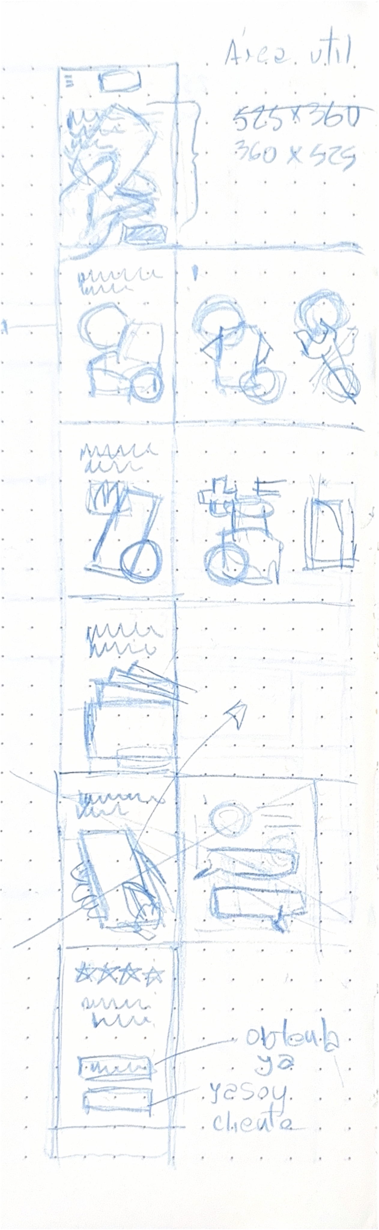
Preliminary sketches
Initial wireframing for first tests
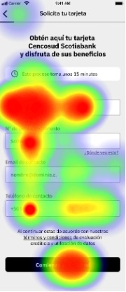
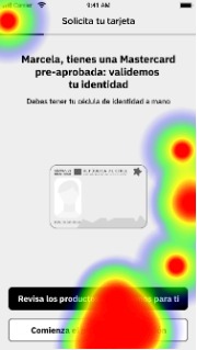
User testing (Maze heatmaps)
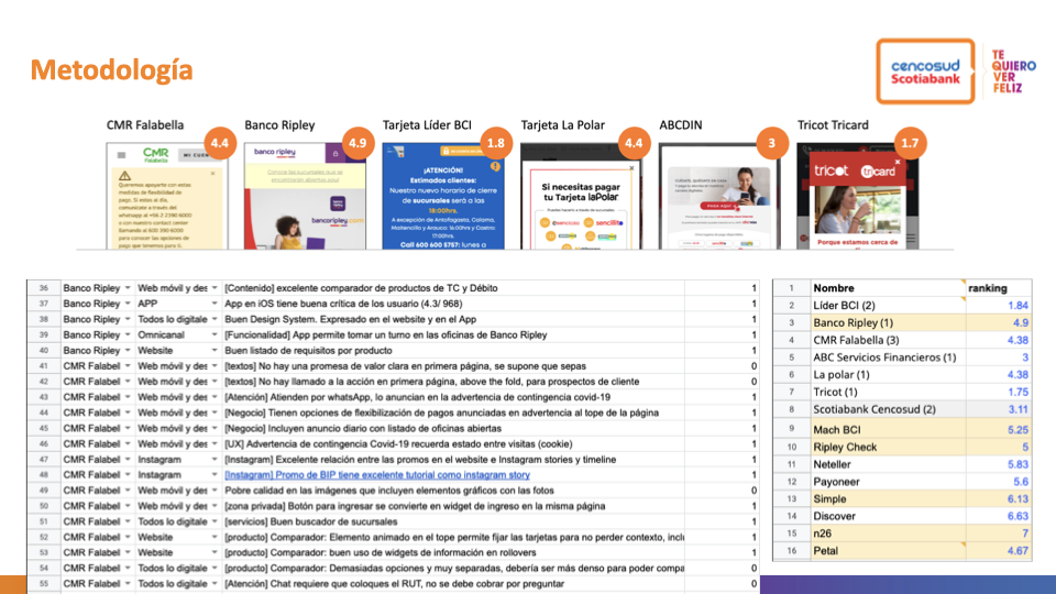
Heuristic comparison of the competition and other references
Trust-First Strategy
- Quick research of local and international competitors.
- Testable wireframes of critical screens.
- Collaborative workshops with stakeholders.
Structured Research

Module testing (Maze heatmaps)
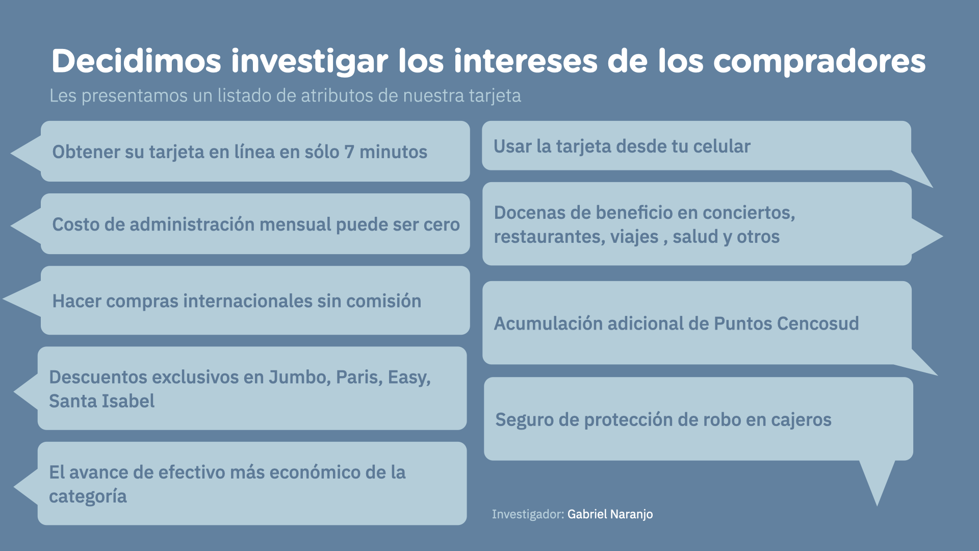
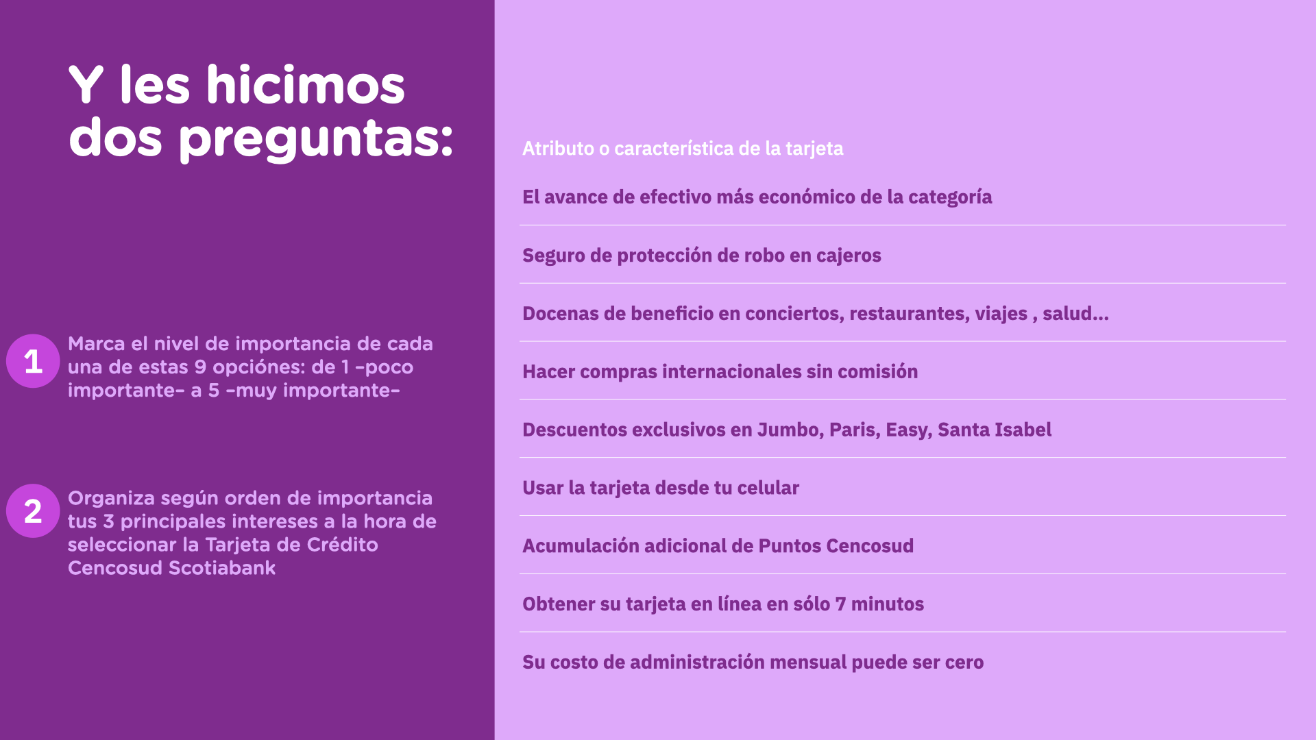
Preference surveys about card features
- Moderated remote testing: 6 users on landing + key screens
- Mass survey: 350 users to prioritize features.
- Module testing: 6 testers × 9 sub-flows.
- Internal pilot: 20 users from the organization.
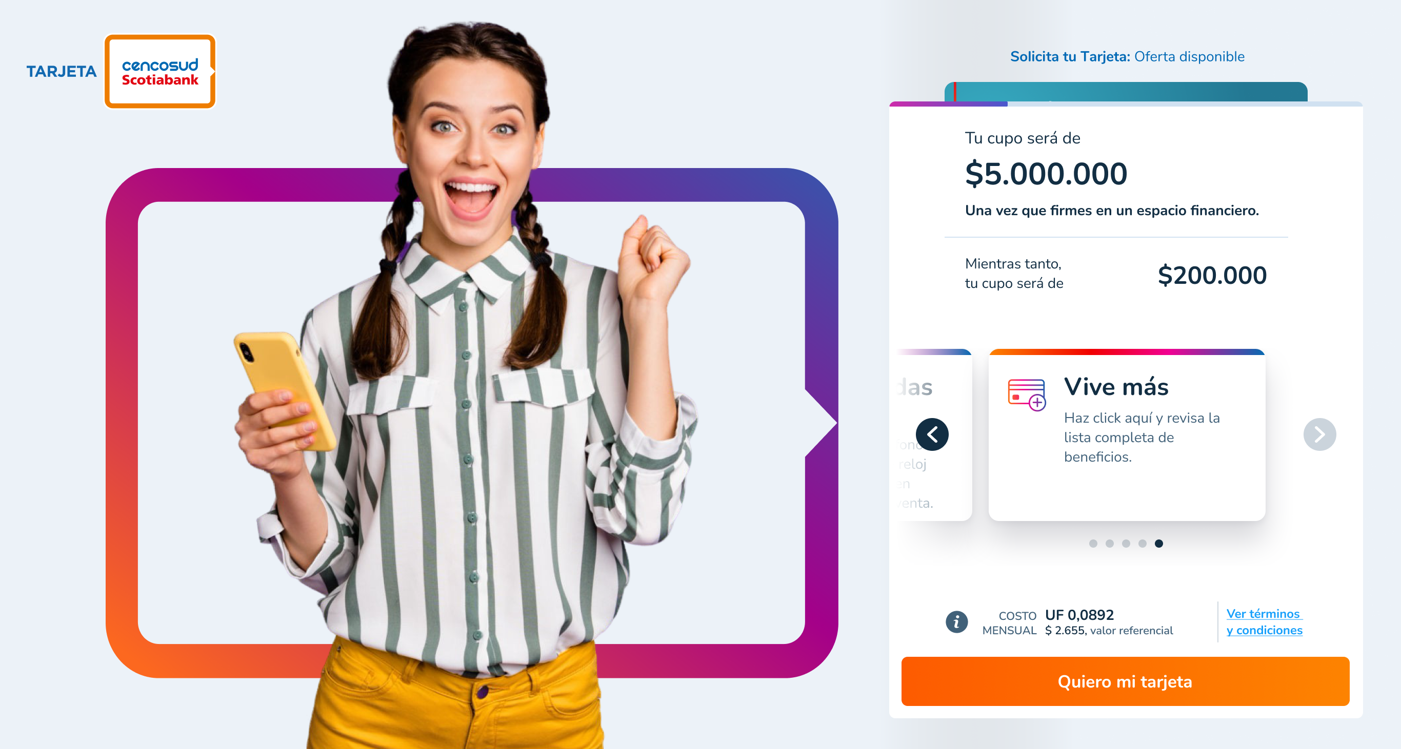
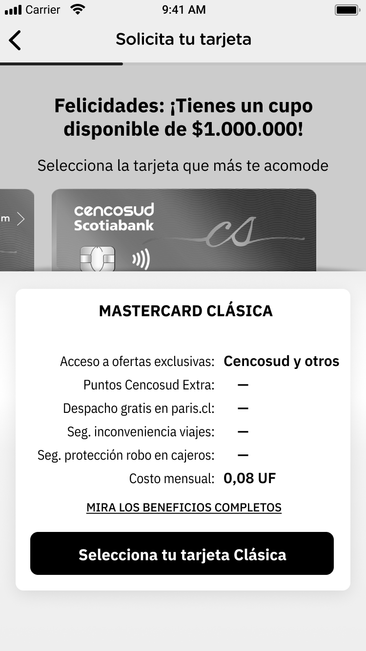
2. Define: The UF Pricing Problem
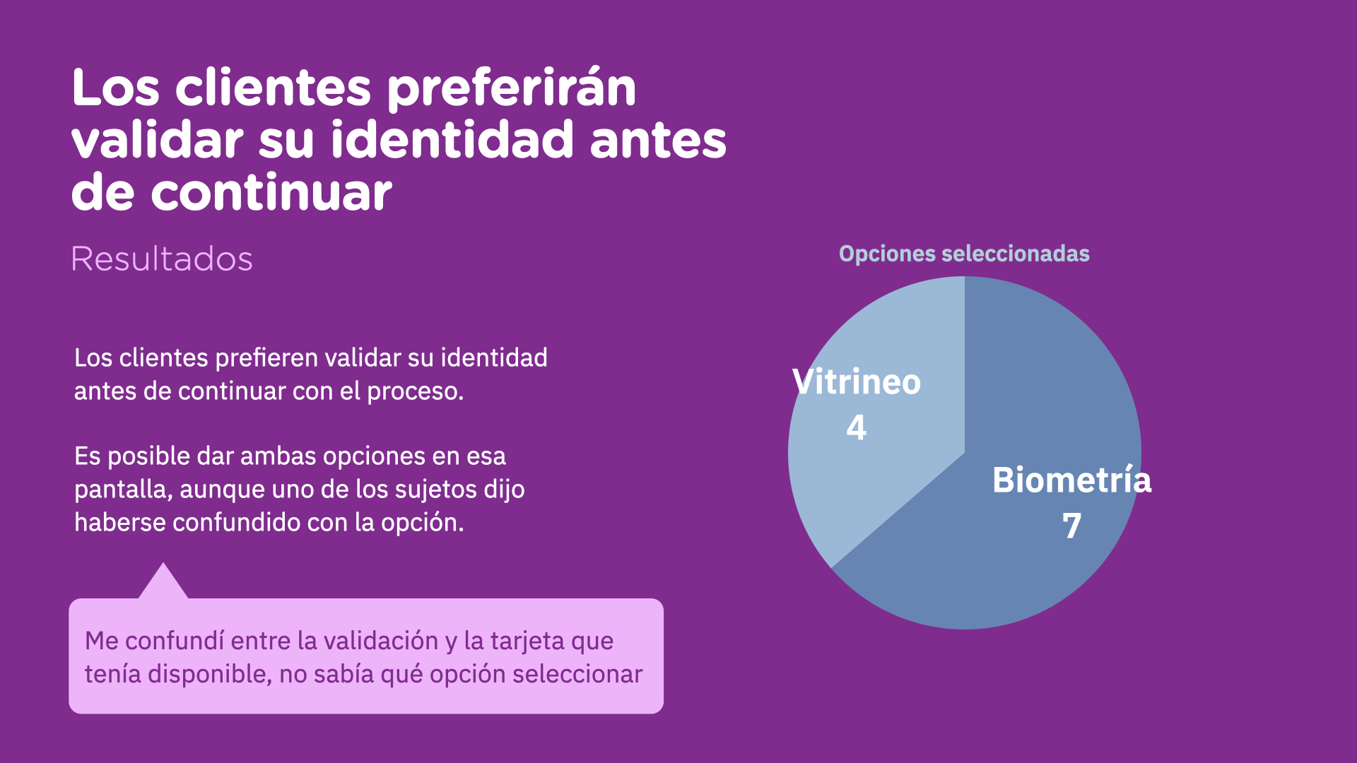
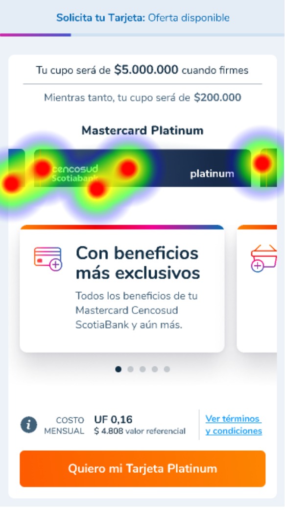
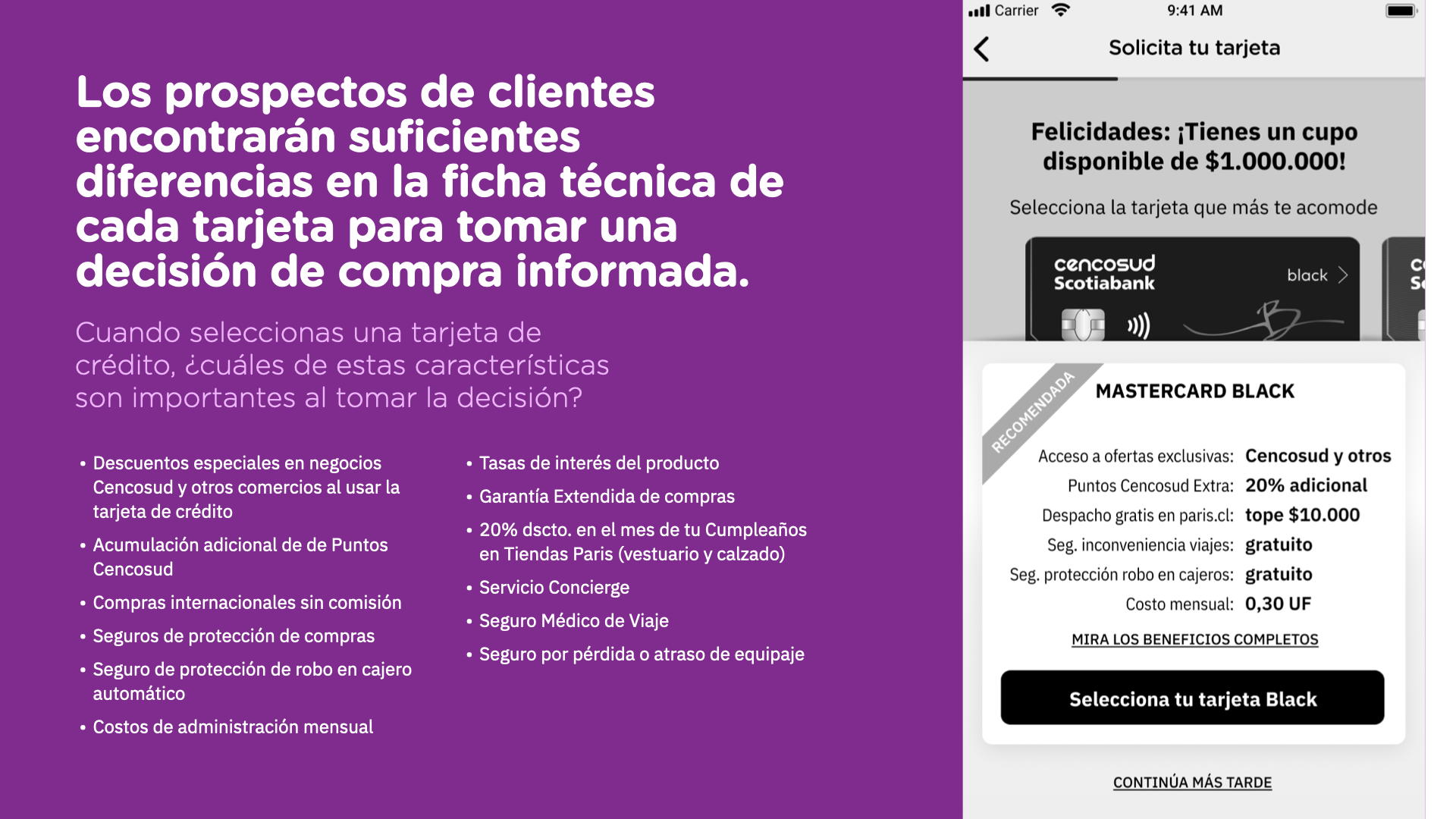
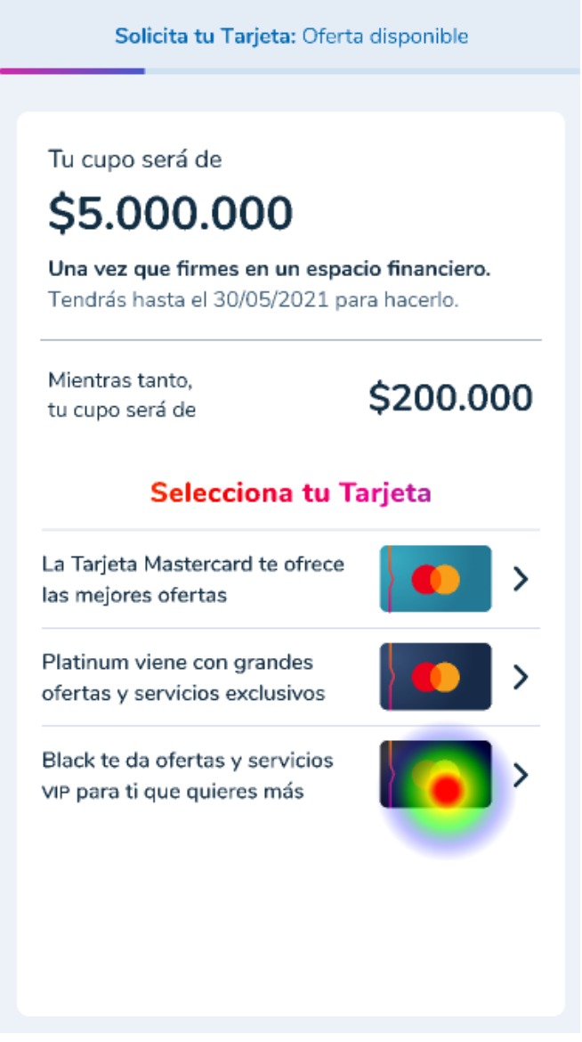
The most critical insight emerged during testing: when prices appeared in UF (Unidad de Fomento), users abandoned.
Moderated user tests: card sorting
Survey results about product features
They didn't understand what that price meant and suspected hidden costs or "fine print".
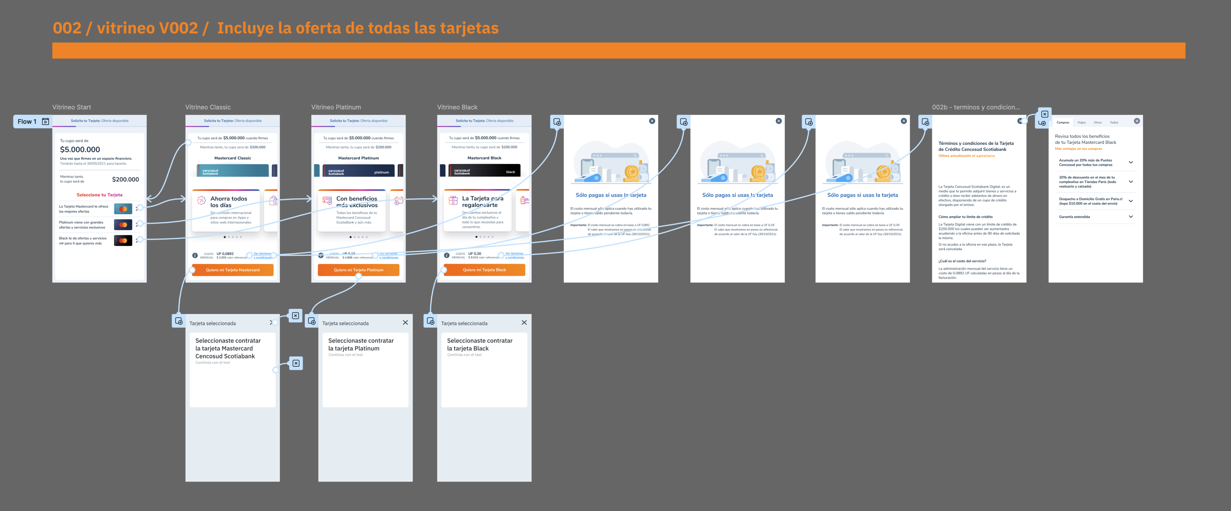
3. Ideate: Modular "Train Car" Design
I designed the onboarding as independent modules:
- Fast cars: pre-filled confirmation screens.
- Decision cars: steps requiring user input.

This architecture allowed:
- Phased development
- Independent testing of each module
- Reuse in other group products
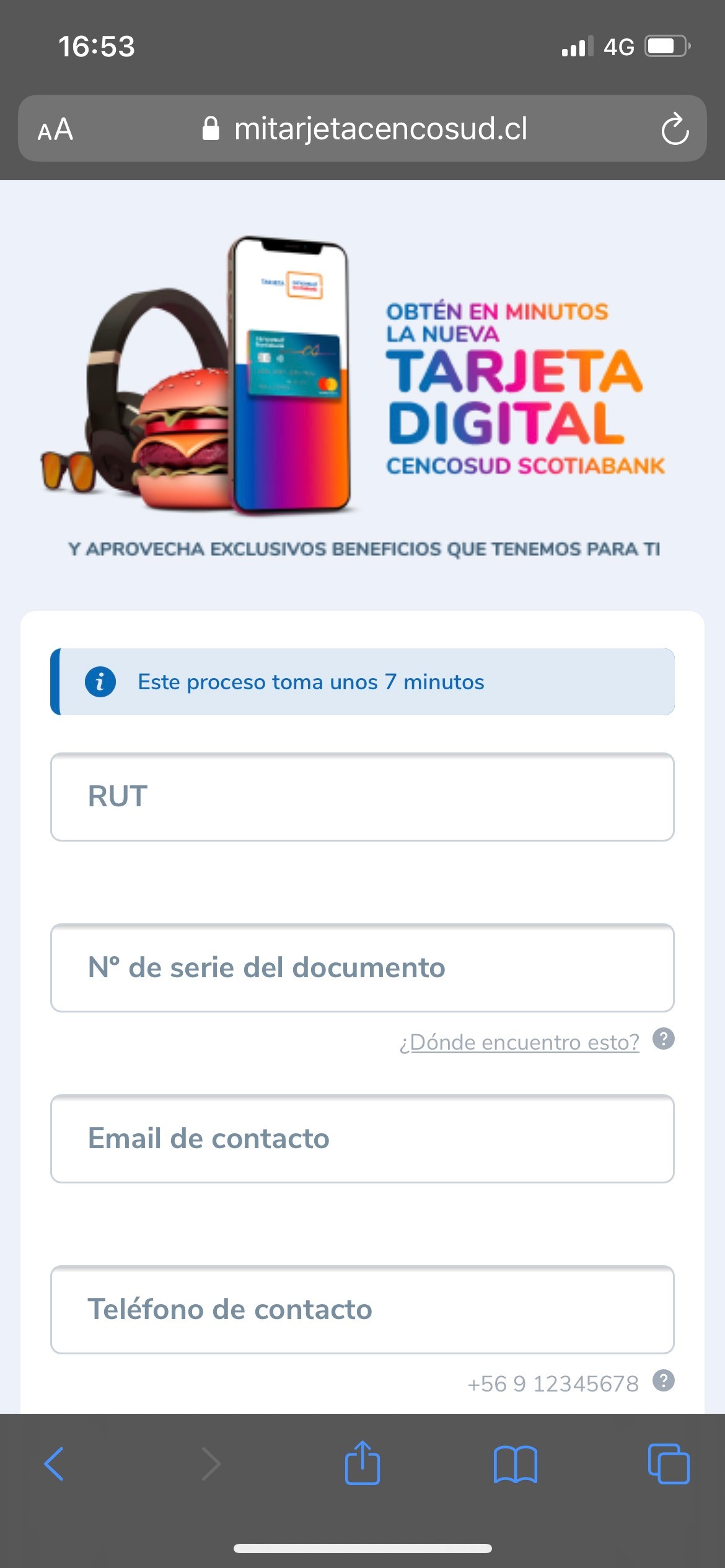
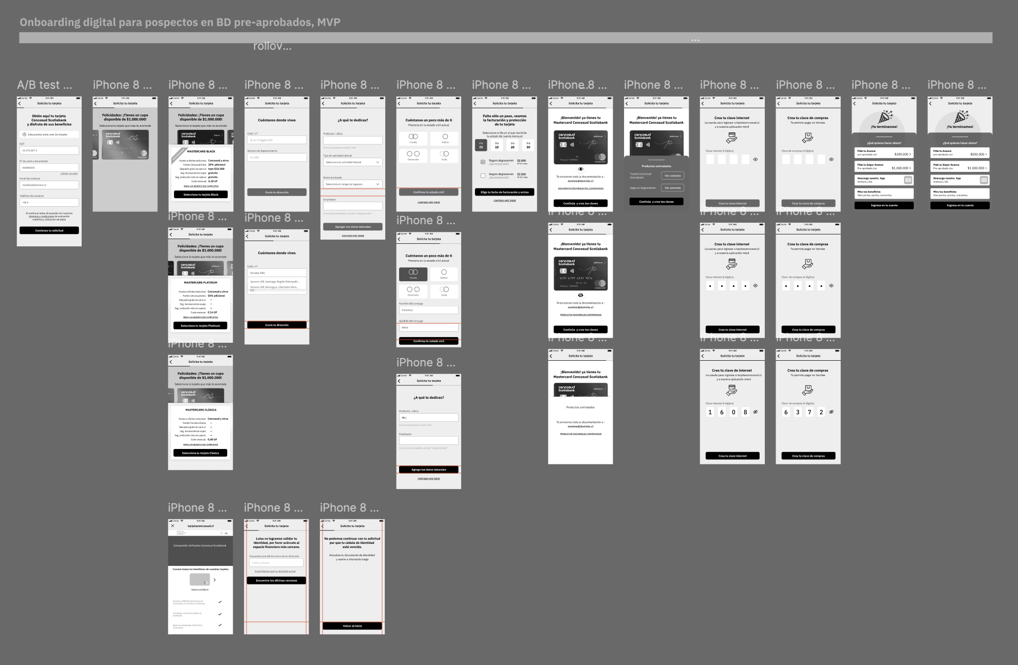
4. Prototype: From Wireframe to MVP and beyond

Initial wireframe
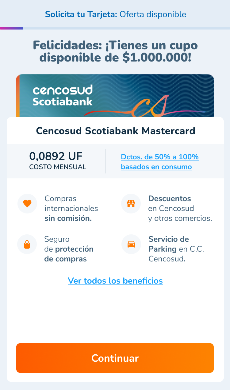
MVP launched
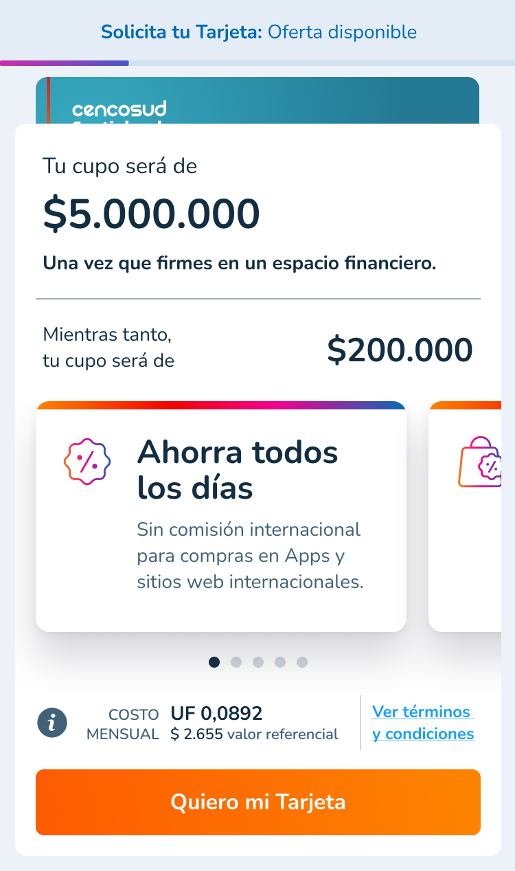
Final version
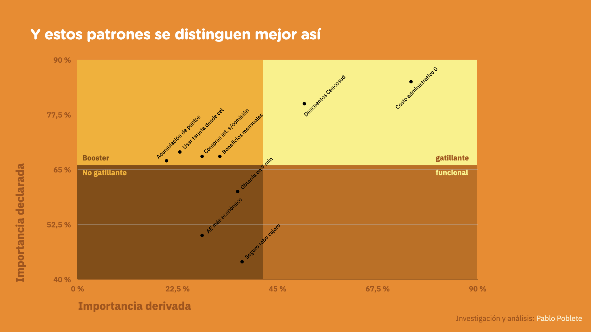
Card sorting + mass poll revealed that fees were the #1 decision factor, but showing them in UF generated distrust.
5. Test: Exhaustive Validation
Multi-device user testing: desktop and mobile trials
Moderated test during the pilot
- Module testing: Each of the 9 sub-flows tested
- Multi-device: Different resolutions and operating systems
- Internal pilot: 20 internal users before launch
- Post-launch monitoring: Weekly Hotjar analysis + feedback
Results


Thanks to Gabriel for his contributions and staying on top of this project. The numbers show there's analysis behind the design proposals.”
Andres Pinto, Product Owner
Cencosud Scotiabank
Learnings
- Relationships matter more than functionality: Building trust with the team gives you capital to propose ambitious changes.
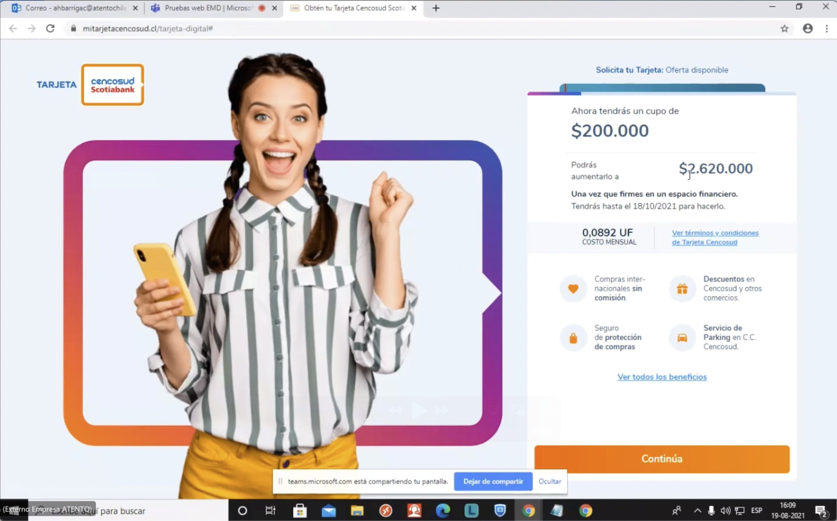
- Details can have massive impact: An apparently small change (UF to pesos) generated 24% more conversions.
- Well-done MVP > perfect late solution: Better to launch something simple that works and iterate based on real data.
- UX is a long game: The most important results come after multiple iterations.
Contact me
Go to next case study


Bringing transparency to an obscure cost structure to get to 24% increased conversions
Finder
File
Edit
View
Go
Window
Help
Cencosud Scotiabank
tarjetacencosud.cl
Bookmark
tarjetacencosud.cl
16:05
The challenge: pandemic = closed offices = zero credit card sales.
We need a way for people to obtain our credit card without visiting the local branch"
During the pandemic, Cencosud Scotiabank was facing a critical problem: all of their brick and mortar branches were closed, and they didn't have a 100% digital solution for clients to obtain a new credit card.


Spacer
They needed a digital onboarding solution, fast, but also with high security and usability standards.
The challenge was twofold: it was the first serious UX initiative for the company (a UX Design culture didn't exist) and also it needed to comply with strict financial norms.
Spacer
My Methodology: Design Thinking in an Adverse Context
1. Empathize: Building Trust While Researching


Customer Journey Map
Preliminary sketches
Initial wireframing for first tests
User testing (Maze heatmaps)
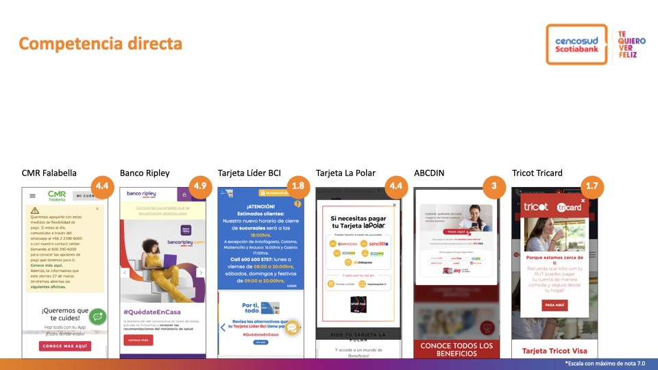
Heuristic comparison of the competition and other references
Spacer
Trust-First Strategy
- Quick research of local and international competitors.
- Testable wireframes of critical screens.
- Collaborative workshops with stakeholders.


Spacer
Structured Research
Module testing (Maze heatmaps)
Preference surveys about card features
Spacer
- Moderated remote testing: 6 users on landing + key screens
- Mass survey: 350 users to prioritize features.
- Module testing: 6 testers × 9 sub-flows.
- Internal pilot: 20 users from the organization.
Spacer
2. Define: The UF Pricing Problem
The most critical insight emerged during testing: when prices appeared in UF (Unidad de Fomento), users abandoned.
Moderated user tests: card sorting
Survey results about product features
Spacer
They didn't understand what that price meant and suspected hidden costs or "fine print".
Spacer
3. Ideate: Modular "Train Car" Design
I designed the onboarding as independent modules:
- Fast cars: pre-filled confirmation screens.
- Decision cars: steps requiring user input.
Spacer
This architecture allowed:
- Phased development
- Independent testing of each module
- Reuse in other group products


Spacer
4. Prototype: From Wireframe to MVP and beyond
Initial wireframe
MVP launched
Final version
Spacer
Card sorting + mass poll revealed that fees were the #1 decision factor, but showing them in UF generated distrust.
Spacer
5. Test: Exhaustive Validation
Multi-device user testing: desktop and mobile trials
Moderated test during the pilot
Spacer
- Module testing: Each of the 9 sub-flows tested
- Multi-device: Different resolutions and operating systems
- Internal pilot: 20 internal users before launch
- Post-launch monitoring: Weekly Hotjar analysis + feedback

Results
+ 24%
7 min
roadmap
2 stores
Thanks to Gabriel for his contributions and staying on top of this project. The numbers show there's analysis behind the design proposals.”
Andres Pinto, Product Owner
Cencosud Scotiabank
Learnings
- Relationships matter more than functionality: Building trust with the team gives you capital to propose ambitious changes.
- Details can have massive impact: An apparently small change (UF to pesos) generated 24% more conversions.
- Well-done MVP > perfect late solution: Better to launch something simple that works and iterate based on real data.
- UX is a long game: The most important results come after multiple iterations.


Spacer
Contact me
Go to next case study